David Lynch Foundation
The Critical Mass intern Project
What’s the David Lynch Foundation? Created to bring the teachings of Transcendental Meditation to at-risk populations.
The Ask: To increase donations by growing brand awareness for the David Lynch Foundation.
How:
Create a better website with a seamless donation experience
Drive understanding of where donations are going through real-life, interactive stories
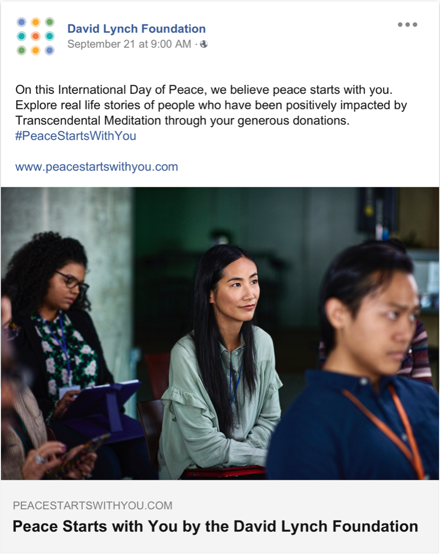
By leveraging TM’s growing list of celebrity endorsers as well as sharing this post above in conjunction with the International Day of Peace, we will have a healthy drive of initial users of the digital experience
This will be a responsive web page, however we are going to walk through the desktop version of the site. The microsite is a home for 5 stories of people impacted by TM and DLF. The stories will be told via metaphor and typography, and some pages will be interactive.
To begin, the user would scroll down and choose one of the 5 paths. These panels include visual metaphors which are assumptive metaphors for overcoming adversity. When our work is funded, we would conduct user interviews to get first hand accounts of what our users’ lives were like pre-DLF and post DLF
Say the user chooses Katheryn – we thought that Katheryn’s story was so moving we wanted to share it with the world. So, the user learns that Katheryn was in a relationship where she was domestically abused and her son witnessed it. Due to the large amount of time her son spent in the hospital because of severe panic attacks, Katheryn was not able to keep a job and lost her home.
She describes this time of her life as Completely hopeless. Here is our first interactive screen- the ocean background interacts with the typography and the user can interact with the typography as well. These interactions are supposed to replicate the feeling of the text. However not every panel will be interactive or image based
This panel is more informative. Here we would introduce the user to the DLF and TM. On this side panel, we are defining who the DLF is and what TM is. So, our user will be able to learn about TM and DLF in the experience.
After Katheryn and her son learned TM, they were able to get back on their feet and heal their trauma. Katheryn’s son who experienced aggression and a short temper says TM helped take that all away. This ocean in the background would “wash” away the text.
TM gave Katheryn the inner strength to never go back to her abuser and it helped her life come back to color. This page would interact with the users cursor to seemingly paint the color back onto the screen.
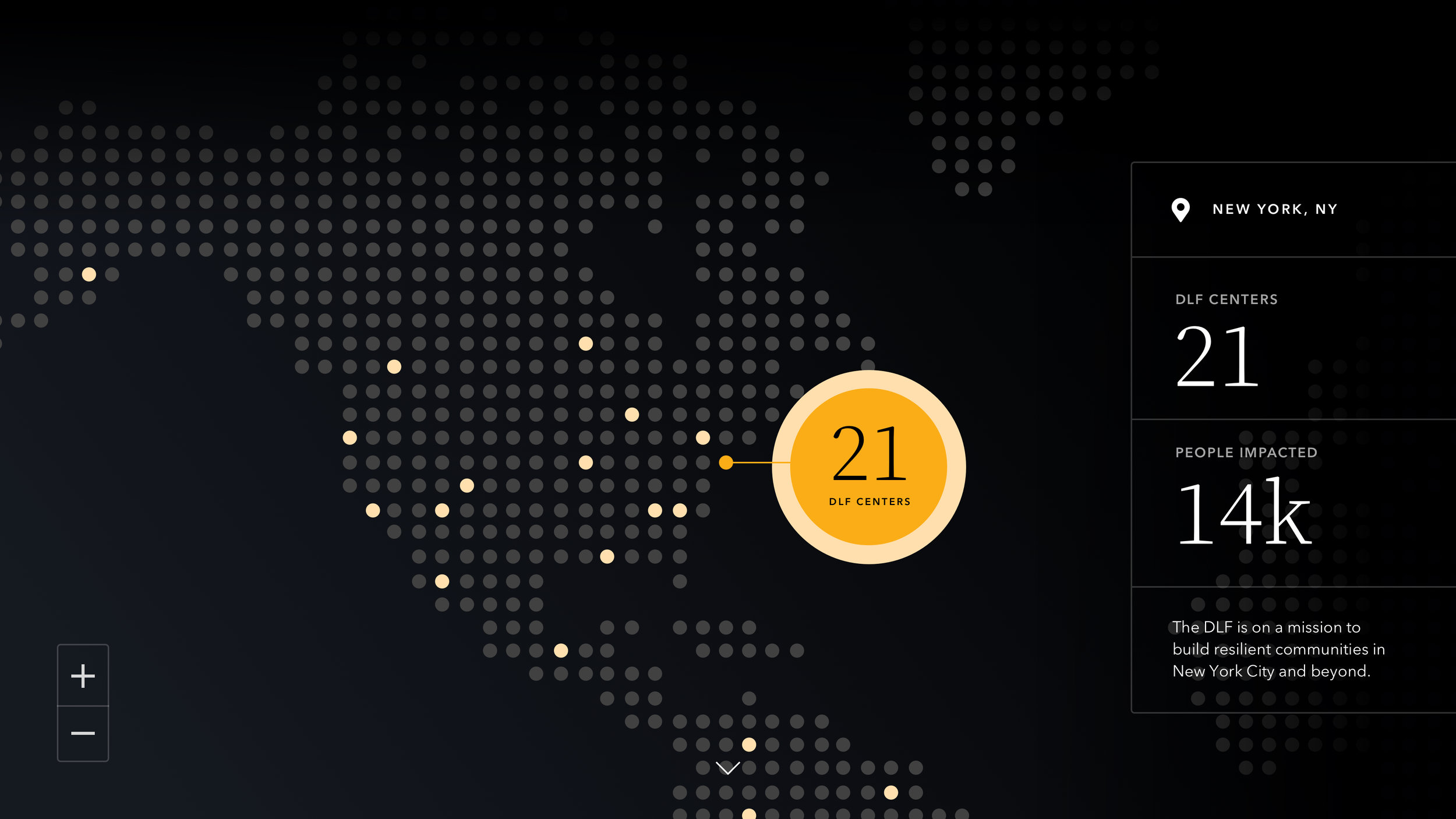
This dot map would show just how many DLF centers there are in the country along with other domestic abuse statistics.
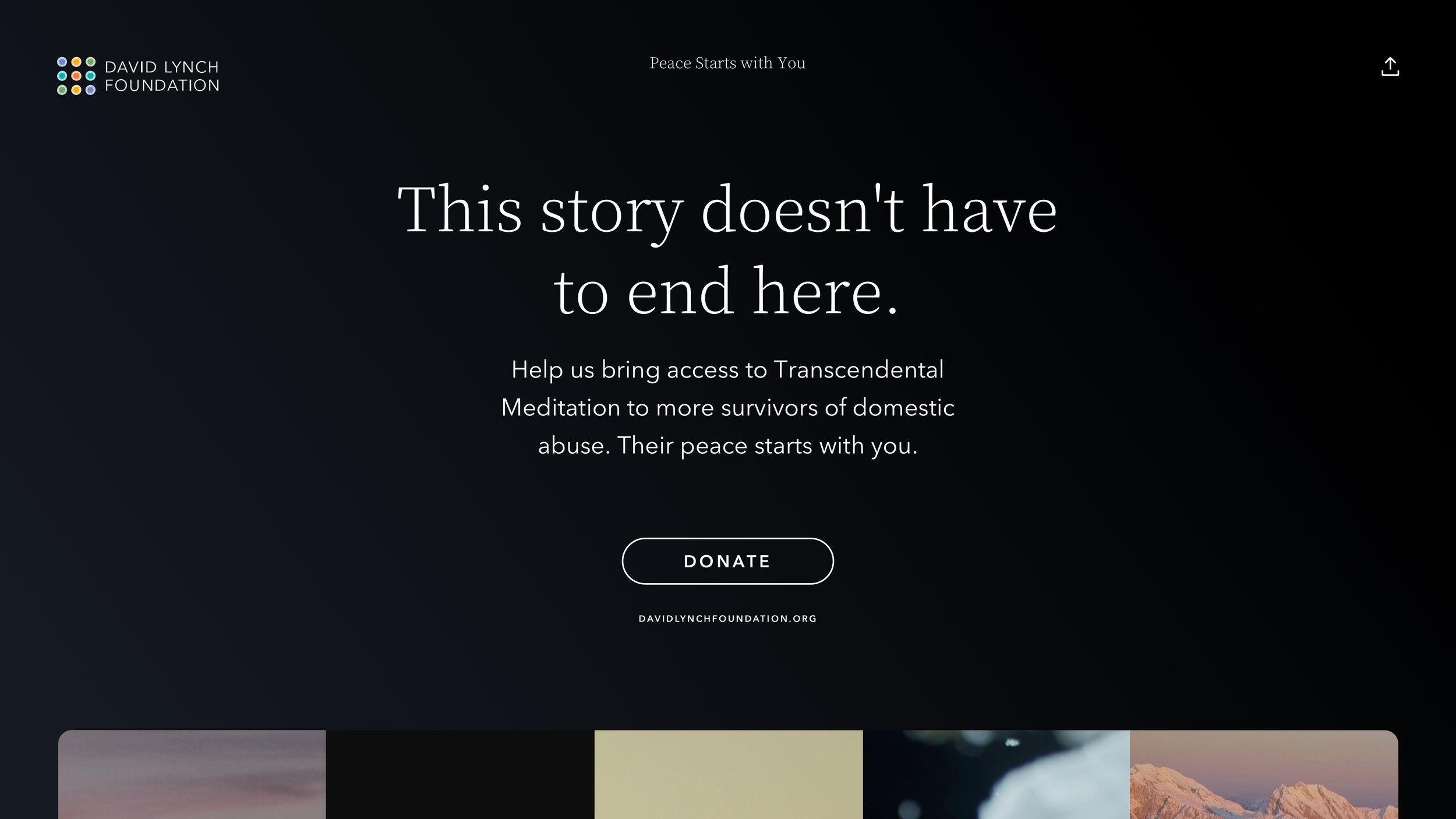
Our final page of the experience uses “Donate” as the main CTA. The secondary CTA on the experience allows us to view the DLF website. By scrolling down, you can also go through the other experiences.
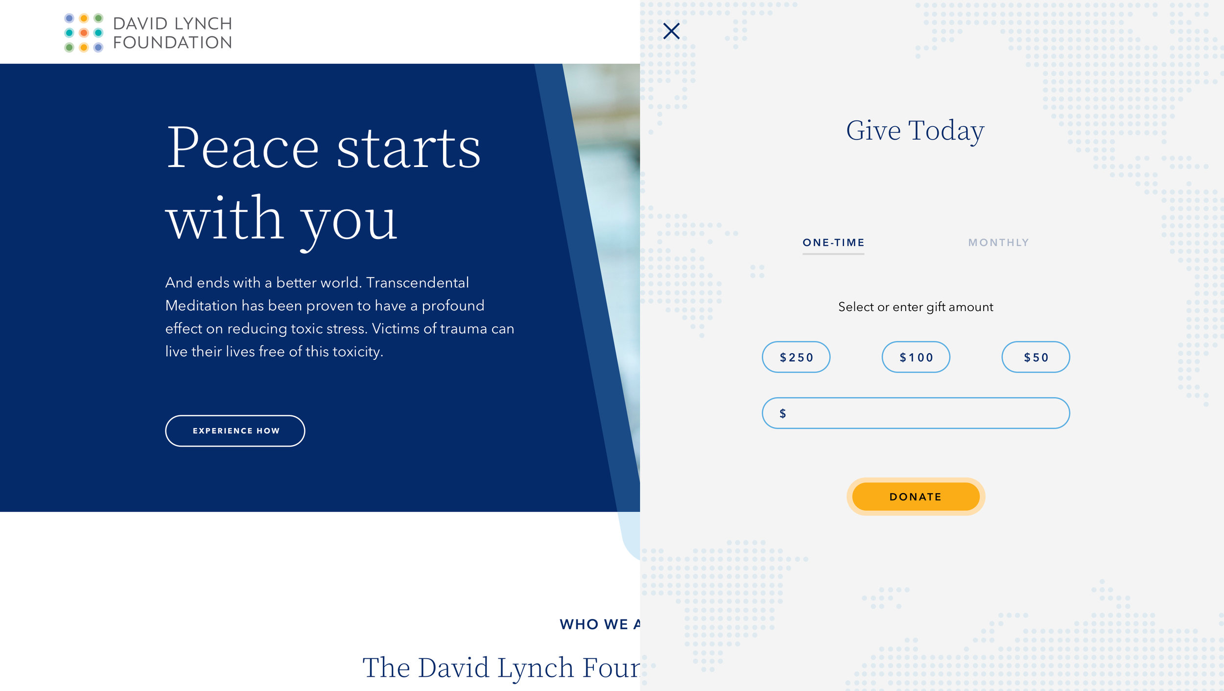
So here is our proposed home page... One thing that has not changed is the logo. The logo was more recent so we kept it, and drew inspiration from the colors and the orbs. We reduced the navigation to a hamburger menu and took steps later on in the page to make sure navigation was still simple.
When you click the donate button, a donate module slides from the right and the user is able to choose how often they wants to donate and how much. This would take them to a simple two step donation process where they can choose which cause they want to donate towards. So, the user donates $100 directly through the website. We would want to use a payment processor, DonateKindly, embedded seamlessly on the website, so users don’t have to hesitate when they are trying to give money.
When 3 months pass, the user will get an email from the David Lynch Foundation. In the email is a report of where her donation went and how it was spent.
Agency: Critical Mass


